

Key Takeaways
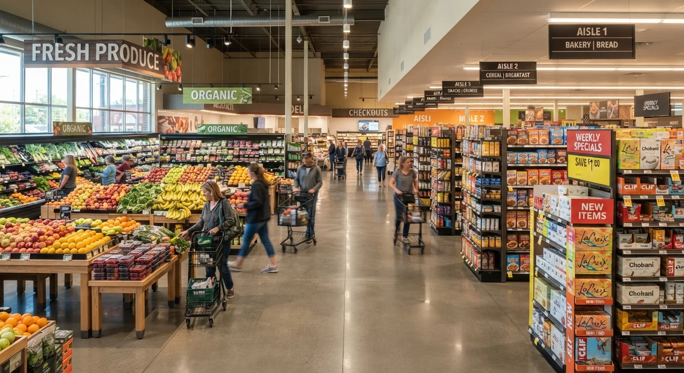
- Produce is placed near the entrance to create a fresh, healthy impression that influences subsequent purchases.
- Eye-level shelf space is the most valuable real estate in any aisle - higher-margin items are placed there deliberately.
- End-cap displays create an illusion of deals; items there aren't always on sale.
- Checkout aisles are stocked with high-impulse, low-consideration items by design.
- Shopping with a list and a clear path through the store are the most reliable defenses against layout-driven overspending.
- Understanding these tactics doesn't eliminate their influence, but awareness meaningfully reduces unplanned spending.
Grocery Store Layout Psychology
Grocery store layout psychology refers to the deliberate design choices retailers make - including shelf placement, product positioning, and store flow - to influence how much time shoppers spend in the store and what they ultimately buy. These decisions are based on decades of consumer behavior research and are applied systematically across most major chains. The goal is to maximize the chance that shoppers encounter - and add to their cart - profitable items they didn't plan to purchase.
Retail planners often use a discipline called planogramming - the science of arranging products on shelves to optimize both visibility and sales velocity - alongside foot-traffic heat mapping to refine store layouts.
The Store Isn't Arranged for Your Convenience
A grocery store's layout might feel intuitive, but very little about it is accidental. Every decision - where the produce sits, which products appear at eye level, what lines the path to the checkout - is the result of intentional planning designed to shape shopper behavior. Understanding the logic behind that planning is one of the most practical steps a consumer can take toward more intentional spending.
The design principles at work in most large grocery chains are part of a broader set of retail tactics. For a full look at how pricing psychology reinforces layout, see our piece on price anchoring and loss leaders - the two systems work in tandem.
~50%
Grocery purchases that are unplanned
Consumer research and industry estimates consistently suggest roughly half of grocery purchases are not on a shopper's list before entering the store.
70%
Purchase decisions made in-store
The Point of Purchase Advertising International (POPAI) has long cited figures suggesting the majority of purchase decisions occur at the shelf rather than before the trip.
4-6x
Higher sales from eye-level vs. floor-level shelving
Retail industry data generally shows that products at eye level can outsell floor-level shelf placement by a significant multiple, underscoring why that space commands premium placement fees.
Key Layout Tactics and What They're Designed to Do
The Fresh Entrance
Produce and floral departments are almost universally placed at the store entrance. The reasoning is behavioral: exposure to fresh, appealing food early in a shopping trip creates a positive emotional state. Shoppers who feel good - and feel virtuous about healthy choices - tend to spend more overall.
Eye-Level Shelf Placement
The shelves positioned between roughly waist and eye height are the most expensive real estate in any aisle. Suppliers pay slotting fees to earn that placement. Higher-margin or brand-name products dominate this zone. Store-brand equivalents and value options are frequently on the bottom shelf - worth checking deliberately.
End Caps
The displays at the end of each aisle get far more foot traffic than mid-aisle shelving. Shoppers often interpret end-cap placement as a signal of a deal, even when no discount is present. Before assuming an end-cap item is a bargain, compare its price per unit against the same product in the main aisle.
Staples at the Back
Milk, eggs, butter, and bread are stocked at the rear of most stores. Getting to them requires passing hundreds of other products. That walk is a feature, not an oversight - it's engineered exposure.
The Checkout Gauntlet
Checkout lanes are lined with small, low-cost items - gum, candy, batteries, magazines - that require minimal deliberation. These are high-impulse, high-margin products placed at the moment when shoppers have the least patience to second-guess a small purchase.
Default to the Bottom Shelf
Make it a habit to look at the lowest shelf in any aisle before adding an item to your cart. Store-brand and value alternatives are disproportionately stocked there. Comparing unit prices - cost per ounce or per count - rather than package prices gives the most accurate comparison.
How to Shop Around the Design
Awareness of these tactics is genuinely useful, but it doesn't fully neutralize them. The most reliable counter-strategies are behavioral rather than purely cognitive.
- Use a list - and build it by category. Grouping items by store section means you move through the store with purpose rather than browsing. Our guide on shopping with a list covers how to structure one effectively.
- Check above and below eye level. Reflexively looking at the top and bottom shelves in any aisle will surface options the store is not actively highlighting for you.
- Treat end caps as neutral. Don't assume a display position signals a price advantage. Read the tag and compare.
- Eat before you shop. Hunger measurably increases susceptibility to impulse purchases - this is well established in consumer research.
- Set a cart checkpoint. Midway through the store, glance at what's in your cart versus your list. Items that don't appear on the list should clear a deliberate yes-or-no decision.
These habits, practiced consistently, connect to broader patterns covered in our look at everyday shopping habits that compound over time. Small, repeated choices shape annual spending more than any single big purchase does.
Putting It in Context
Grocery store design is not a conspiracy - it's applied consumer psychology, and understanding it puts the shopper in a more informed position. Retailers have an incentive to maximize spend per visit; shoppers have an incentive to spend on what they actually need. Those goals only align some of the time.
Pairing layout awareness with broader shopping discipline - including knowing when prices on major categories tend to dip and how loyalty programs actually work - gives you a more complete picture of the retail environment. For a consolidated view, our full guide to smarter shopping across categories pulls these threads together.
“The store is a communication medium. Every square foot tells a customer what to think about and how to feel. It's an environment built to sell.”
— Paco Underhill, Consumer behavior researcher and author of 'Why We Buy'